TITLE / AUTHOR
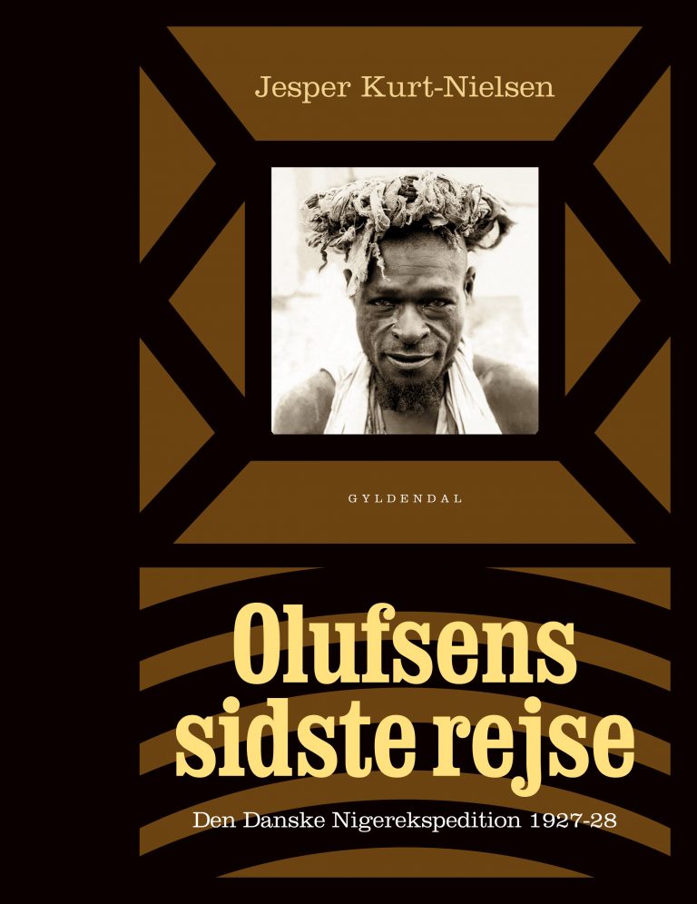
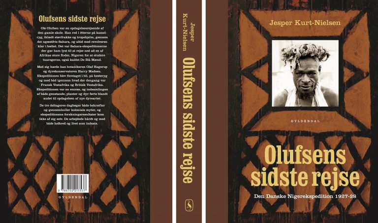
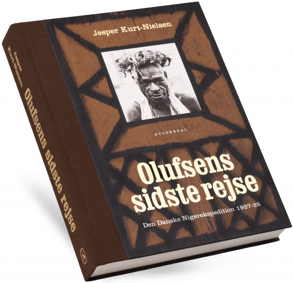
“Olufsens sidste rejse”, travelogue by Jesper Kurt-Nielsen (half-binding).
CLIENT
Gyldendal, Denmark 2017
MY SERVICES
Book cover design
Interior layout
↓
BOOK DESIGN
In 1927-28 the Danish officer Ole Olufsen travelled Niger extensively together with the botanist Olaf Hagerup og the taxidermist Harry Madsen. In this book about the last of the great explorations, the voices of these three men seem very present. And there is a captivating quality to the photographs. I worked closely with production manager Anitta Aaen Sundby, who has a wonderful flair for materials and an abundance of experience. The design challenge was largely about being faithful to the subject of the book but avoiding the obvious stylistic clichés of the period.

INTERIOR DESIGN
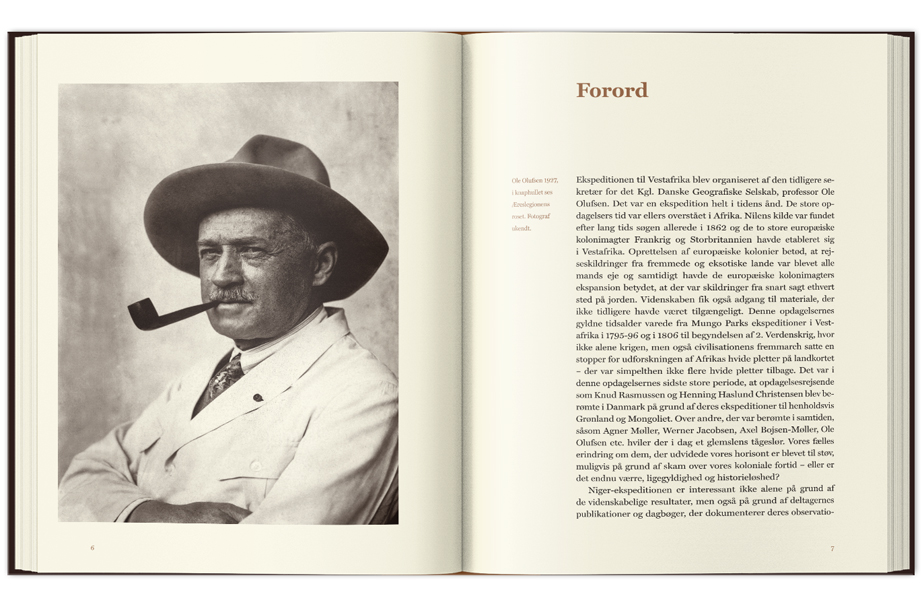
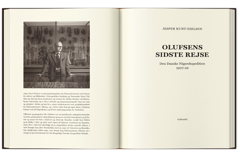
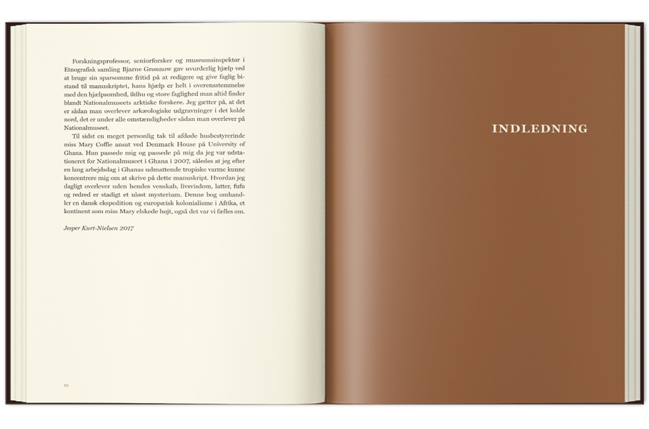
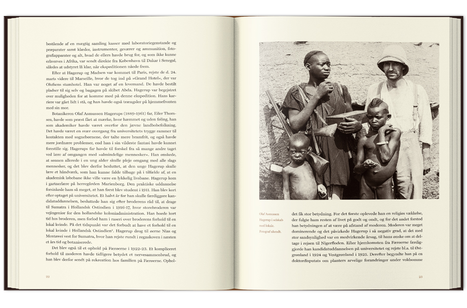
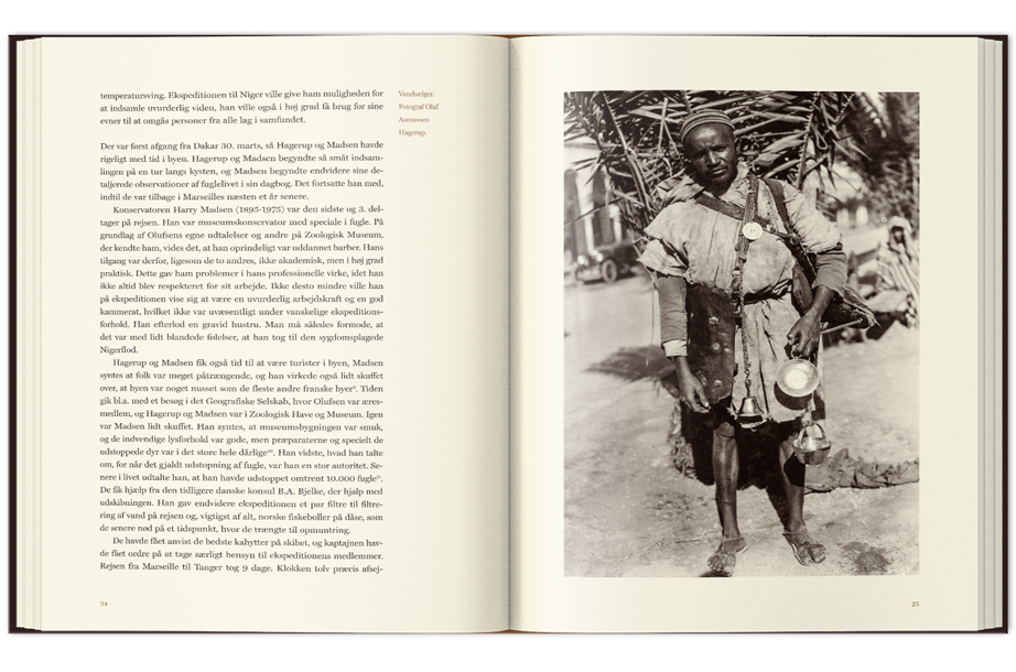
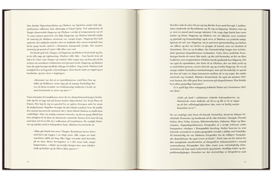
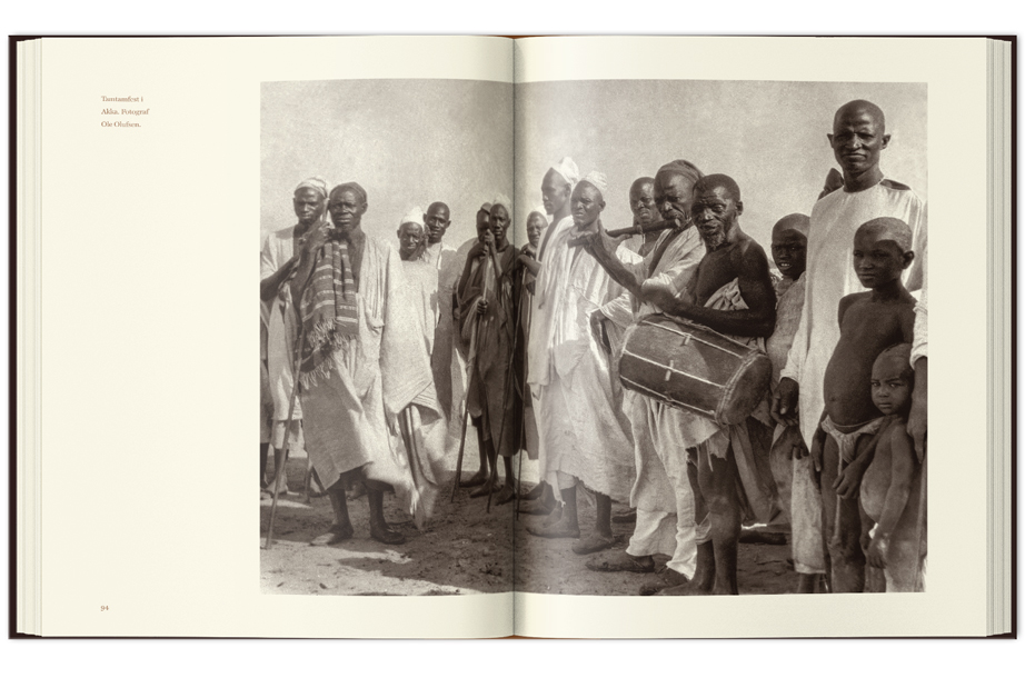
I wanted a light and modern expression while still honoring historical period of the book. A relatively heavy paper was chosen for the content. 150 g Munken Pure has a creamy tone which lends the book a luxurious expression. I decided to apply a subtle, warm duplex to the photos to add some depth to them. The spot color was also used for headlines, captions and pagination. I wanted to avoid the obvious typefaces from the period, as they generally suffer from overuse. After some trial and error, I chose the font Miller Text, a relatively new interpretation (Matthew Carter, 1997) of an old font. I find there’s something discreetly ”designed” and masculine about it. The wide margin against the center fold makes for luxurious space and prevents the body text from disappearing into the fold, as the heavy paper prevents the book from fully opening to the back. Also the centerfold is used for captions. I would have liked to use more full page photos, but the heavy paper would have resulted in a very thick book, and fortunately the finished result shows that it is not necessary at all.
THE BOOK COVER
One of the original images were to be used on the cover. As the editor didn’t want the image to go to edge, I searched for simple images from the Hausa culture for the background. But the results seemed too much like a poster for an ethnographic museum. I created a clay relief and another in woodcut inspired by Hausa, but used as a background image they both seemed artificial. The current background image is sufficiently simple to unify the front page without dominating it. On an alternate front page, I used the same composition but reduced the pattern to simple black shapes. The result resembled the patterns of the Hausa culture but also Art Deco, which still dominated Europe. But the stylization worked against my original intention to communicate the rich and gritty feeling from the expedition. It seems clear that the woodcut in the background of the final result anchors the book better. For the title I chose a matte metal foil, tinted somewhere between gold and silver. I’m not a big fan of very shiny metal foils, as they can make it difficult to read a text from a distance. Unfortunately the foil we choose refused to stick to the cloth on the spine. We agreed to substitute it with a matte gold foil that did the job excellently.
