Book design
Danske eventyr i Iran
Interior layout for Morten Hansted’s richly illustrated book about Danish traces, stories and encounters in Iran.
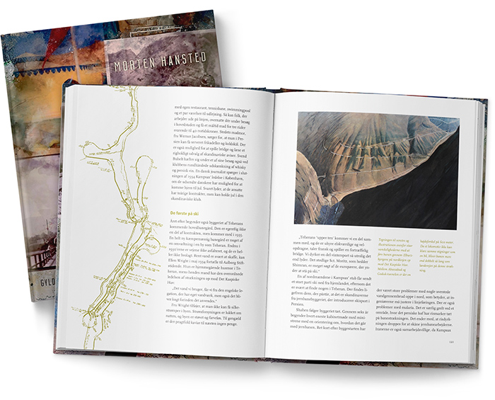
I spent two weeks with several hundred photographs and got nowhere. There was no shortage of material — Morten Hansted had worked on the book for years — but there was nothing to choose by.
It is a situation I have been in more than once. A publisher hands the designer a box of pictures and leaves both the selection and the interpretation to the last link in the chain.

We solved it in a meeting. The author, the editor and I sat down together and agreed on criteria before a single page was laid out: prefer images that tell a story; give portraits lower priority; include documents only where they add something the text does not; and discard pictures too damaged to hold up, rather than retouching them back to life.
After that the book began to order itself. Danske eventyr i Iran tells the stories of Danes who left traces in Iran at different moments in history, and the material could finally be read as a sequence instead of a pile.

From there the job was to give the material a calm and generous structure. I worked with a grid that let the images dominate without crowding the pages. The book needed air, but not distance.
The photographs carry most of the historical presence. They take the reader into the period almost immediately, so the layout had to support that rather than explain too much around it.


Some of the documents were reproduced as objects rather than flat images — placed on the page as if they were papers lying on a white surface, with a slight shadow. It breaks the strictness of the grid and gives parts of the book a scrapbook quality.
That small shift mattered. It makes the archive feel less institutional and more personal — as if the reader is going through papers left behind by people who were actually there.