Book design
Glimt
Cover design and interior layout for Billie Koppel’s memoir about childhood, music, family and finding a voice of her own.
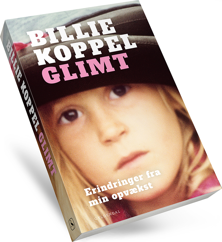
Everything began with an informal, slightly blurred photograph of a girl with an open, curious and stubborn look. It had the kind of presence a more polished image would have lost.
When I handed the cover in, it went to an editorial meeting, and the room split roughly down the middle. Half thought the soft, unprofessional photograph was exactly right. The other half thought it dragged the whole book down. The editor who had the manuscript defended the choice and carried it through.
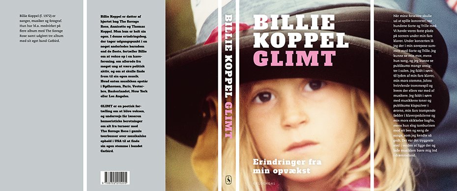
The objection was reasonable. A blurred snapshot on a Gyldendal cover is a risk, and it is fair to ask whether it looks careless rather than deliberate.
But the blur is doing something. It tells you the book is about a real person and a real childhood rather than a constructed one. And it closes the distance to the reader, because most of us have exactly those pictures at home: snapshots and holiday photographs, badly lit, out of focus, and kept anyway.
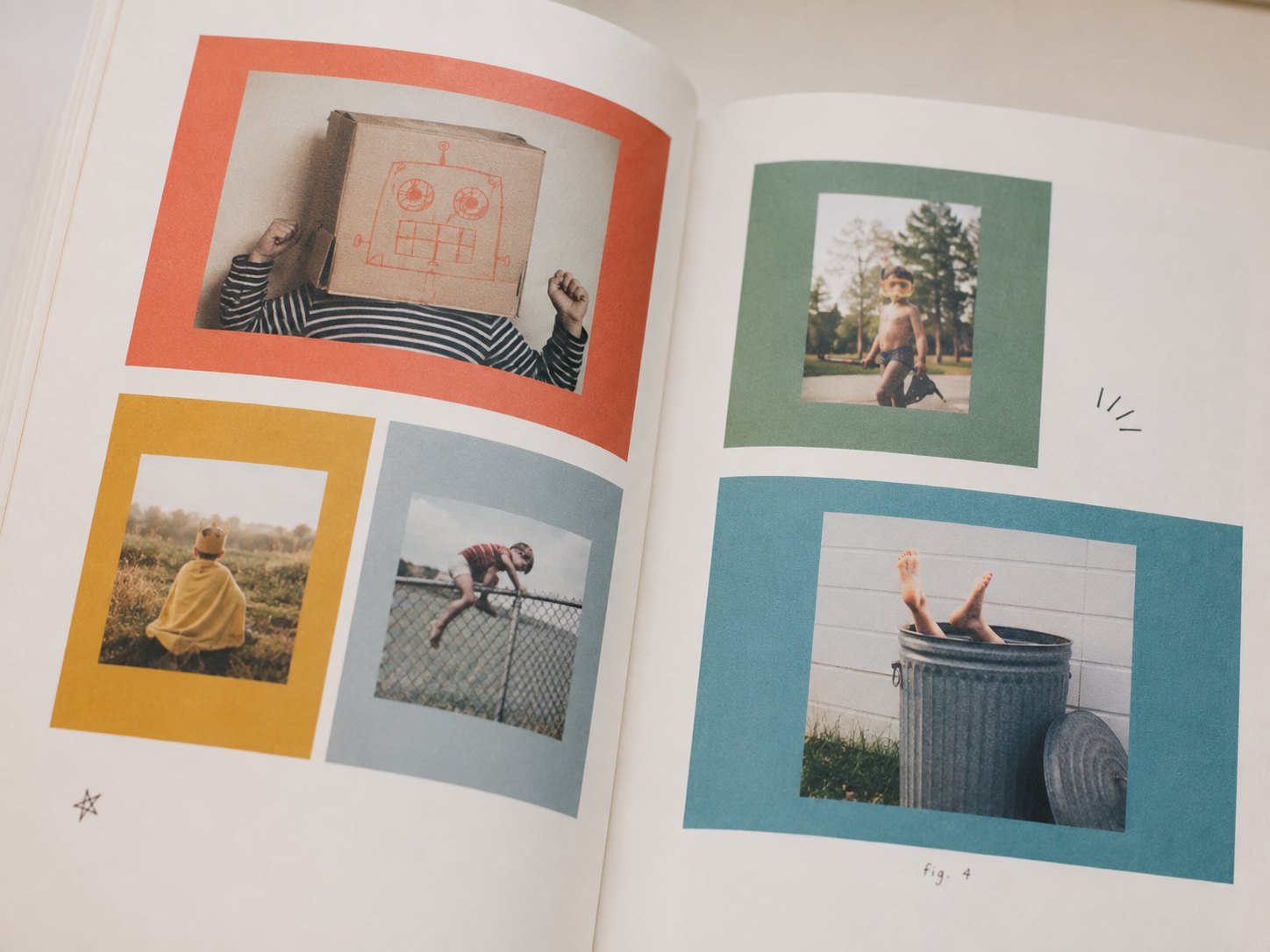
Inside the book, personal childhood photographs were placed on coloured backgrounds. They bring the book’s humour and warmth into view — private, playful and not too polished.
I kept the typography simple, almost blunt. It had to meet the girl’s gaze without decorating it. The cover is built around one image, one look, and the decision not to get in the way.