Book design
Vindens tid
Cover design, illustration and interior layout for Ronit Galapo’s novel, first published in Scandinavia and later adapted for the American edition.
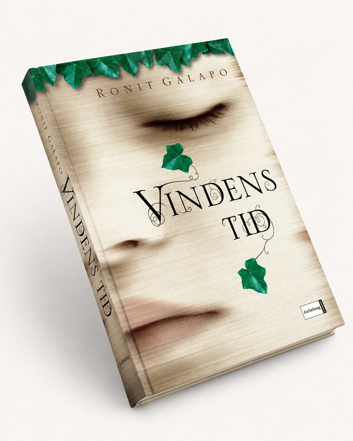
Several years after the Scandinavian publication, the author’s agent got in touch. Ronit Galapo was still so fond of the artwork that she wanted it adapted for the American edition, Strong Winds from Nowhere.
That is one of the best kinds of praise a book designer can get: an image made for one edition that still fits the book years later, in another language and another market.
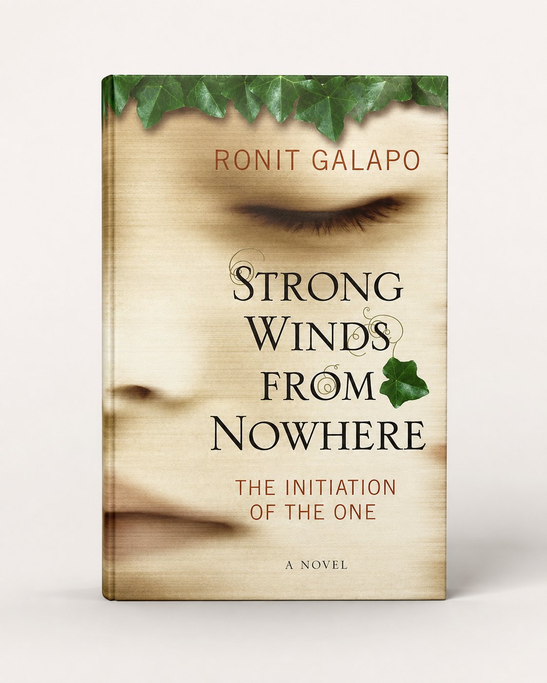
The cover it was adapted from was made in 2004, and had already been reused for the Norwegian and Swedish editions.
Vindens tid is a novel with a mythic quality — a coming-of-age story shaped by fantasy, philosophy and psychology. The central themes are abstract and difficult to show directly: truth, identity, memory and repression. I explored several more elaborate symbolic ideas, but they kept getting in the way. What finally worked was smaller and more physical: a face in sand, slowly being erased by the wind.
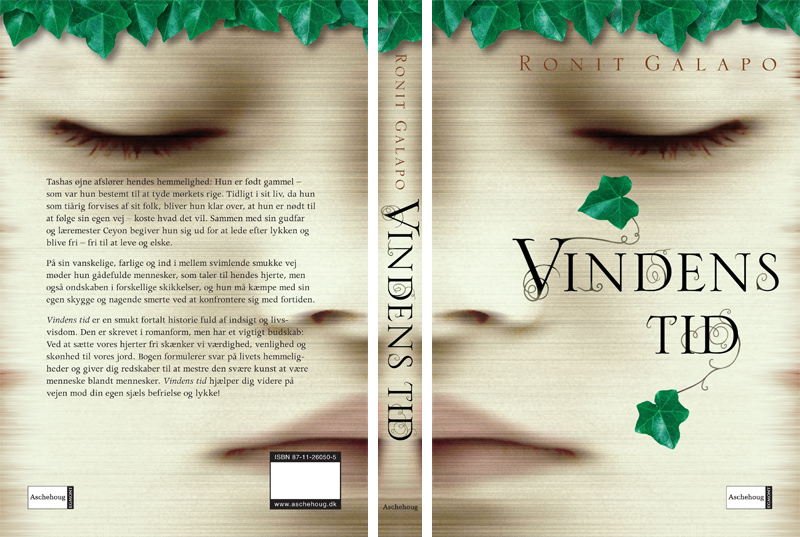
The illustration refers both to the title and to the novel’s central question of identity. The face is present, but unstable. It appears through marks, shadows and traces — as if the image is already in the process of disappearing.
I wanted the cover to feel mysterious, but also gentle. Not dramatic in a loud way, but quiet and slightly unsettling — the kind of image that seems to hold something back.
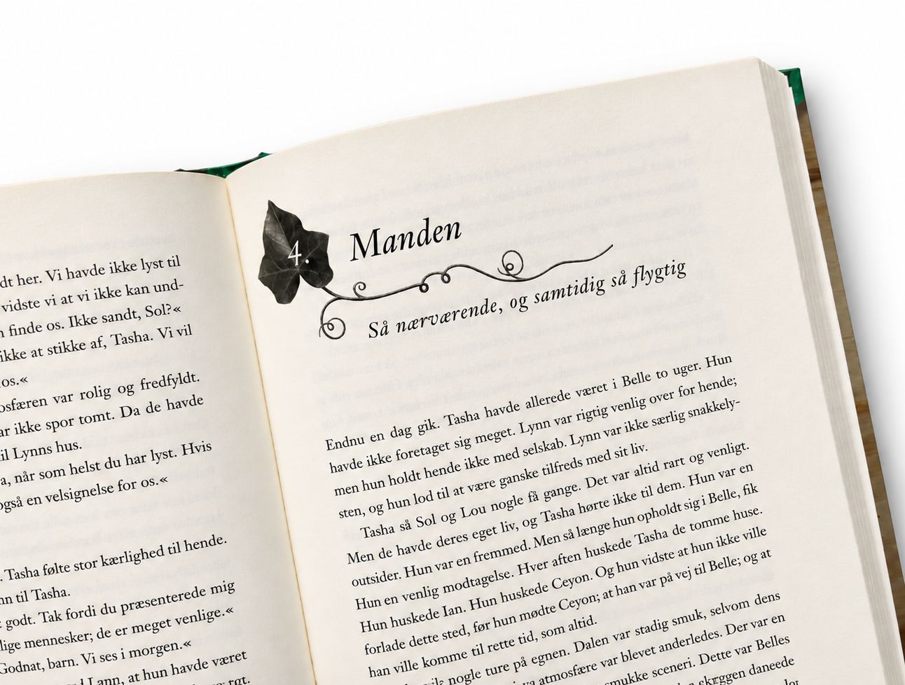
The Danish edition also included the interior layout. The chapter openings were kept restrained, with small vignettes that echoed the cover without turning the book into something decorative. The visual world had to stay light, almost fragile.